

Our guide to logo file formats

At the end of your branding project, we’ll give you all the files you’ll need to tackle any situation. But if you’re not used to these terms, it’s hard to know when and where to use them. Here’s our guide to making sure the quality and colour of your logo is spot on.
EPS: Stands for Encapsulated PostScript. You may have also heard the term “vector file”, which is an image that is built by mathematical formulas and establishes points on a grid rather than pixels. This means this file can change size without ever getting blurry; you could blow your logo up to fit on the moon and it would still look great. For that reason, they’re our favourite for making sure your artwork is crisp, but you won’t be able to open them unless you have software like Adobe Illustrator. That’s ok though, because a file like this is more for the pros. Specs: CMYK, transparent background.
TIFF: Stands for Tag Image File Format. A very large and high resolution file, a TIFF is made up of tiny blocks of pure colour called pixels. If you don’t have an EPS file, a TIFF does its best work in print, but will have a limit on how large it can be scaled before it starts to degrade. Specs: CMYK, 300dpi, transparent background.
JPEG: Stands for Joint Photographic Experts Group. Like the TIFF, a JPEG is made up of pixels, and the information is compressed depending on what resolution and destination you need. Don’t stretch this one too far, because you’ll start to see those individual pixels. You’ll also notice we won’t provide white logos in this format, because JPEGs have a solid white background.
High res specs: CMYK, 300dpi, white background, use for print.
Web specs: RGB, 72dpi, white background, use for web, screen, and socials.
PNG: Stands for Portable Network Graphic. This file is great for screen use, but like the TIFF, boasts a transparent background. Specs: RGB, 72dpi, transparent background, use for web, screen, and socials.
Other helpful information
Finished art files
Here’s an example of how we name our logo finished art files. Even though some file names look identical, we lean into the true purpose and home turf of the file type.
For example, we know that a TIFF file would never appear on a website, so there’s no need to include “300dpi” in the file name. We make it easy for you quickly identify which file you need, without too much to read.

Vectors vs Pixels

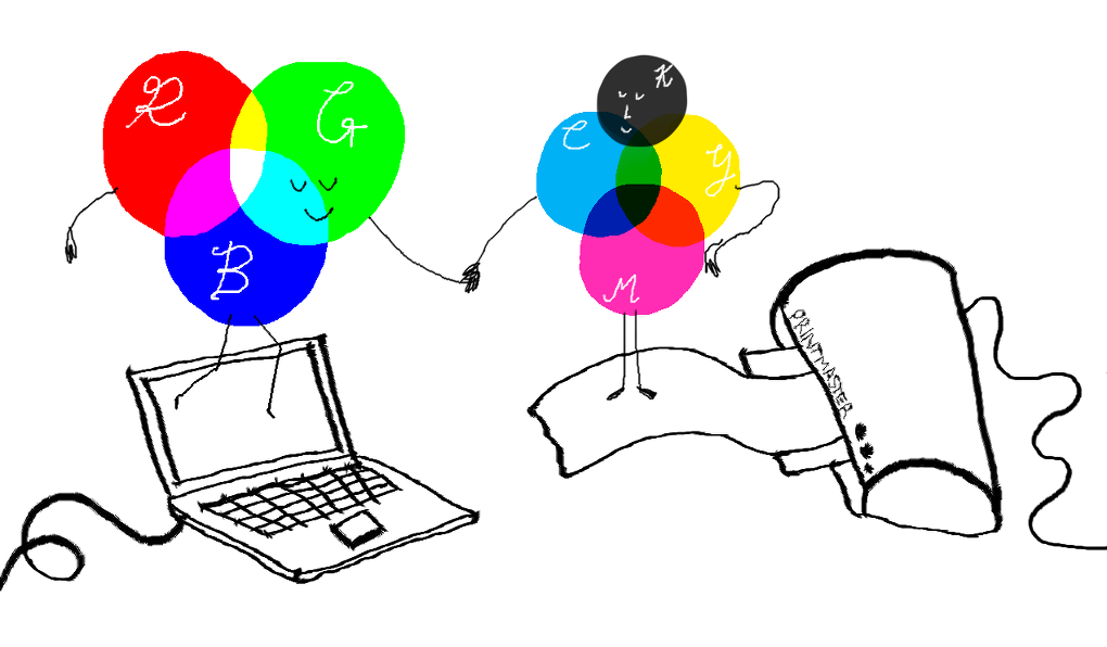
RGB vs CMYK
Need help?
No worries! We’re always available to point you in the right direction after we’ve designed your logo. Send us an email telling us what you’re trying to achieve, and we’ll tell you which file to use.